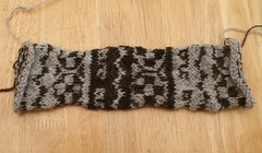
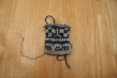
The smaller swatch is the one that includes handspun, pale blue, dark blue and dark green, along with the natural light and dark yarns used in the gauge swatch. I learned that it looks nice even when the yarn is not perfect. I also improved the tension on the floats.
Then I received the Jamison and Smith yarn from England:
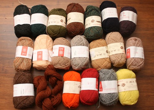
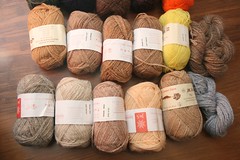
First I noticed that the natural colour I'd hoped to use for the background was grey, and not at all fawn or beige. That's too bad -- the fawn colour was what I was aiming for. I didn't order enough of the fawny and beige colours to use much of any of them, although I did steal some "sh. FC45" from a Jamison and Smith kit I purchased in the same order. Since I don't want to order just a couple more balls, I'm going to alternate just one or two rows of the background colours at a time.
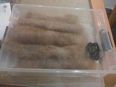
Since I wanted to use some handspun anyway, I blended an interesting roving with white to get another pale yarn option:
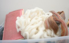
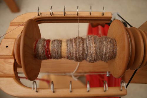
This looked really light when it was in a rolag, but on the bobbin and in the finished yarn, it got darker.
It's clearly the darkest of the light yarns:
It's also very close to the same darkness as the orange I need to use as a "dark" colour. The Prince of Wales painting has bright orange cartouche shapes on a fawn background as one of the peerie patterns, so the orange has to be considered a dark or pattern colour.
I wasn't getting far with using markers to choose colours, so I went to embroidery.
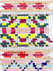
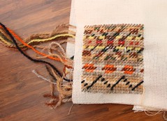
This worked really great. I was able to improvise a little as I went, removing two rows from the charted pattern to make it slightly smaller and make the big X's more visible. Click through to the Flickr image to see my notes on how I modified the embroidered sample as I went along. I also viewed the sample in black and white - I think the contrast is OK overall even though, or perhaps because, the contrast is not even. The orange peerie will draw attention because it's bright orange, the zigzag peerie will draw attention because it's got the darkest yarns, and the big motif will draw attention because it's biggest.
Next step, I believe, is casting on. Perhaps I should do another sample using the real yarns and testing the border ribbing, but I think it will be OK if I don't.
